
Responsive Website SEO That Keeps You Visible on Every Device
Google ranks the mobile experience first. We design and engineer custom responsive websites with SEO built into the foundation—so you earn visibility, protect equity through redesigns, and convert visitors whether they arrive on a phone, tablet, or desktop.
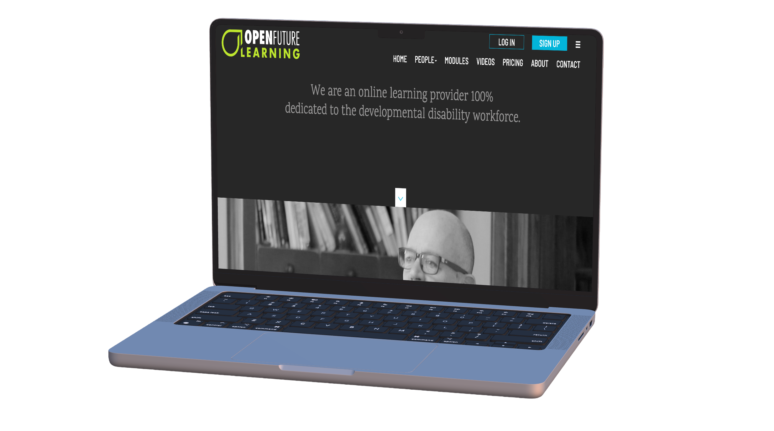
Mobile-first search demands a site that adapts without splitting equity
Responsive website SEO means one codebase, one URL, and full content parity—so rankings, backlinks, and Core Web Vitals all reinforce the same pages.
Mobile-first indexing ready
Google evaluates your mobile experience first. We build one responsive codebase so desktop and smartphone users—and Googlebot—see the same content, structure, and ranking signals.
Core Web Vitals engineered in
Layouts, images, and interaction patterns are designed to protect LCP, INP, and CLS on real devices—not bolted on after launch when rankings are already at risk.
One URL, full content parity
No m-dot sites or device-only redirects. A single URL consolidates backlinks, analytics, and crawl equity while serving a layout that fits every screen.
SEO architecture from day one
Keyword-led information architecture, crawlable headings, technical on-page markup, and HTTPS—so the site you launch is ready to compete in organic search.
A responsive site engineered to rank and convert
We combine custom web engineering with technical and on-page SEO—not a theme with a checklist.
Design & development
- Fluid layouts and navigation that work from large monitors to small phones
- Touch-friendly targets, readable typography, and stable layout shifts
- Optimized images and assets sized for mobile networks
- Secure HTTPS launches and maintainable content management
Prefer a deeper look at engineering scope? See our custom website development service.
SEO foundations
- Intent-led page hierarchy and internal linking
- Title tags, meta descriptions, and heading structure aligned to target queries
- Technical health: crawlability, indexation, and site speed on mobile
- Ongoing programs to grow B2B and regional visibility after launch
Already have a site and need rankings growth? Explore our search engine optimization programs.
From discovery to durable organic growth
Thirty years of white-hat SEO and custom development, applied to how search works now—not how it worked in 2015.
Keyword & competitor discovery
We map the phrases your buyers actually search—including responsive website SEO and adjacent commercial terms—then align page structure and content to that intent.
Responsive build with SEO foundations
Our US-onshore engineers ship a custom responsive site with clean HTML, logical internal linking, schema where it helps, and performance budgets that hold up on mobile networks.
Launch without losing equity
Redesigns and migrations include redirect maps, content parity checks, and indexation monitoring so hard-earned rankings transfer to the new experience.
Ongoing optimization
Post-launch, we refine on-page content, technical health, and local or B2B visibility so rankings compound instead of plateauing after go-live.
Responsive builds that protect search visibility
Recent projects where multi-device design and SEO worked together.
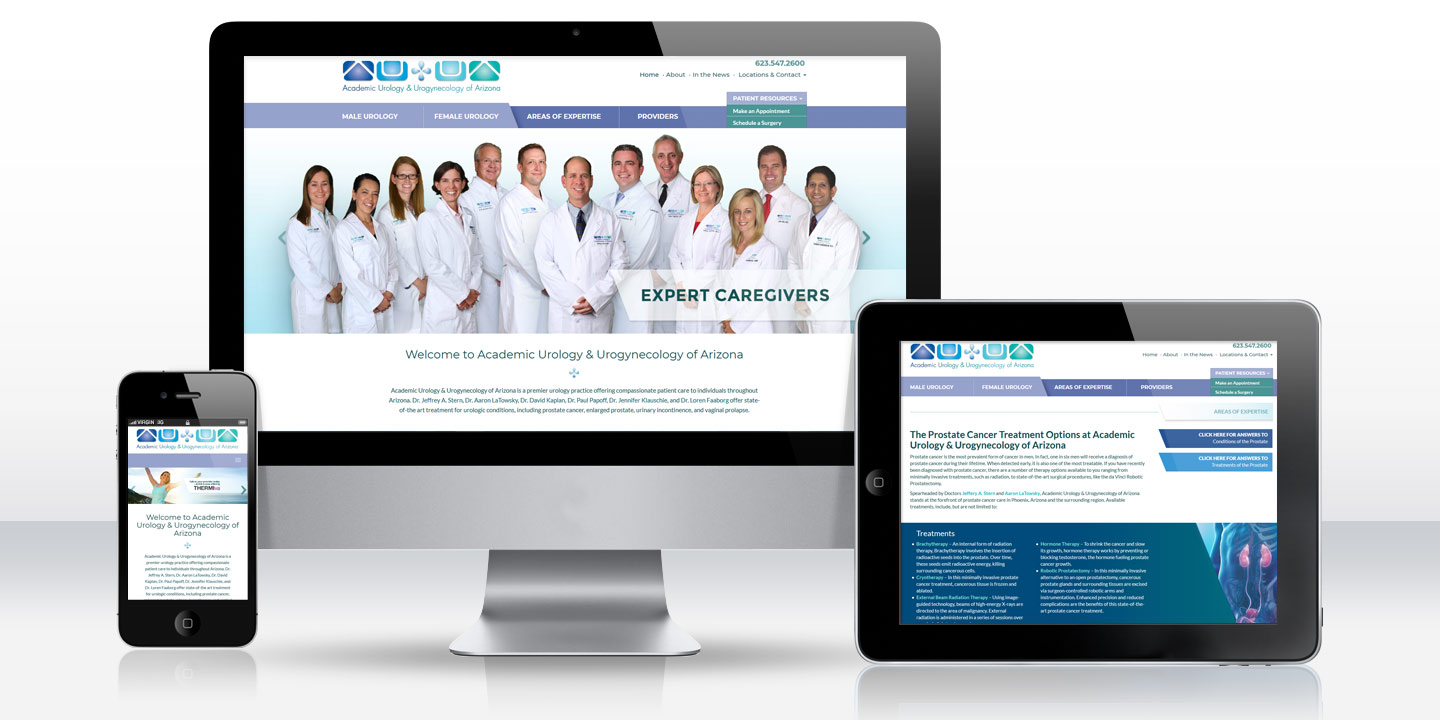
Academic Urology & Urogynecology of Arizona
Responsive Practice Website
A refreshed, mobile-first patient site that preserves SEO equity while clarifying conditions, treatments, and appointment pathways.
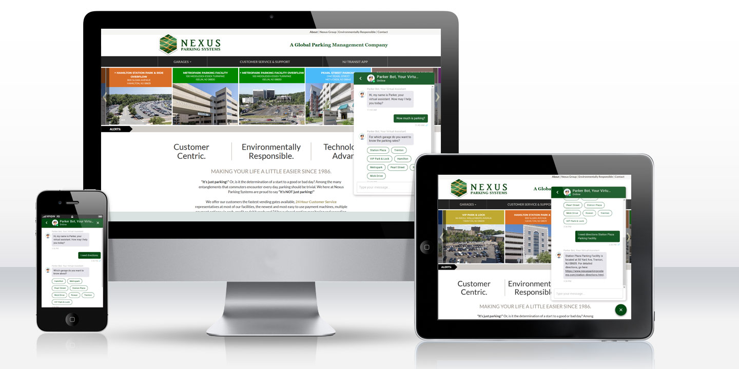
Nexus Parking Systems
Responsive eCommerce Website
A modern, modular site that lets customers find and reserve parking across Nexus locations throughout New Jersey—and manage monthly accounts online.
Responsive website SEO questions
Responsive design is not a single ranking “boost,” but it is how you meet mobile-first indexing, keep content parity across devices, and protect Core Web Vitals. Those conditions are what allow strong content and authority to actually rank.
Almost never for new builds. Separate mobile URLs split backlinks, complicate canonicals, and create content-parity risk. Google recommends responsive design with one URL and the same HTML for every device.
Custom responsive design and development, technical SEO foundations (architecture, metadata, crawlability, HTTPS), performance work aimed at Core Web Vitals, launch redirects when needed, and optional ongoing SEO after launch.
It does not have to. We plan redesigns around preserving URLs where possible, 301 redirects where paths change, content parity, and Search Console monitoring so organic equity is protected through the transition.
AI-generated answers pull from content that is present in the HTML and easy to extract. We avoid hiding critical copy behind mobile-only interactions and structure pages so key facts remain visible and crawlable on every viewport.
Mid-Atlantic and national B2B, manufacturing, medical, and professional services brands that need a custom site which looks right on every device and is built to earn organic visibility—not a template with SEO bolted on later.
Build a responsive site that search engines can trust
Tell us about your current site, rankings goals, and redesign constraints. We’ll outline how a mobile-first build and SEO plan can work together for your business.
We’re ready when you are.
Schedule a free 15-minute discovery call.
We'll listen to where you are and share how we can help.